


The market is a dynamic reality.
Tastes evolve, society changes. Nothing stays the same, and this is as true of people’s lives as it is of brands.
For this reason, companies need to undertake a renewal from time to time. The problem is that this very often wrong-foots the market and meets resistance from the public. All too often, the public is excessively resistant to unexpected change (after all, a rebrand dismantles the structure of expectations the public has built up around an organisation), but it is often right. Because, let’s be frank: not every rebrand gets it right.
Especially when you try to change identity without governing the transition.
When this happens, everything is reset to zero: something that, more often than not, has negative consequences for the brand.
In today’s article, then, we will look together at ten striking cases of rebrands the public hated, searching for recurring patterns of error across the examples.
Analysing them, I am sure, will help us understand what distinguishes a rebrand that strengthens an identity already built from one that puts it at risk.

1. Gap (2010): the shortest rebrand in history
Gap unveiled a new logo that replaced the blue square with the name set in a generic typeface and a small light-blue gradient in the corner. The public reaction was unanimous: the new design was seen as lacking character and indistinguishable from any other brand. Gap even launched a public crowdsourcing exercise for the new logo, an implicit admission of uncertainty about its own brand identity, before reverting to the original design within a week.
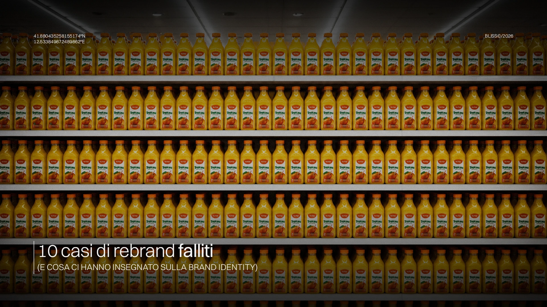
2. Tropicana (2009): packaging still matters
Tropicana redesigned the packaging of its orange juice, removing the iconic image of the orange with a straw and replacing it with a generic glass of juice. Within two months sales fell by 20%, equivalent to around 30 million dollars, because (quite literally) regular consumers no longer recognised the product on the shelf. The company reinstated the original design immediately afterwards.
The case demonstrates an often underestimated principle: immediate visual recognition is as integral to the value of a brand as its broader identity, and must be treated with the same strategic rigour.

3. From RadioShack to The Shack (2009): a rebrand that did not solve the real problem
RadioShack tried to refresh its image by temporarily renaming itself The Shack, in order to appear younger. Yet the rebrand did not address the company’s real problem: its business model, by then irrelevant in the face of competition from Amazon and Best Buy. RadioShack filed for bankruptcy in 2015.
4. Motorola, Motorola Mobility, Moto (2011-2015): the fragmented identity
Following its separation from Motorola Solutions and subsequent acquisition by Google, Motorola went through a series of successive rebrands: Motorola Mobility, then simply Moto, with a visual identity that changed with every change of ownership. The result was a brand the public progressively stopped perceiving as coherent, losing much of its relevance in the smartphone market despite a truly outstanding technological history.
The Motorola case shows what happens when a brand changes its identity structure several times without a shared strategic direction: each step erodes part of the memory built up in the previous ones.
5. Kraft Foods becomes Mondelez (2012): a name the public never adopted
When Kraft Foods split into two entities, the global snacks division adopted the name Mondelez, chosen through an internal employee competition. The name, derived from a blend of ‘world’ and ‘delicious’, was never intuitively understood by the general public, and the company had to invest years of communication simply to explain what it meant and what it stood for, an enormous cost relative to the communicative benefit gained.
A name with no roots imposes an educational cost that few brands can afford to sustain in the long term.

6. JCPenney (2012): the repositioning that confused customers
Under new CEO Ron Johnson, JCPenney abruptly abandoned its long-standing strategy of constant discounts and promotions in favour of a year-round ‘honest pricing’ model, accompanied by a redesign of its stores and communications. Loyal customers, accustomed to the promotional model, perceived the change as a loss of value, while the new positioning failed to attract a new audience. Sales collapsed by 25% in the first year, and the company promptly returned to its previous model.
In short, changing the promise without first preparing the public always leads to disorientation.
7. TIM (2016): an identity divided between heritage and modernity
Over the years TIM has gone through several attempts at visual and communications repositioning, alternating between the historic “Telecom Italia” name and a more international identity built on the TIM acronym alone. The Italian public did not always perceive the transition as coherent, especially at times when corporate and commercial communications conveyed positionings that appeared misaligned with each other.
The Italian case shows a recurring pattern in long-established organisations. The tension between the value of accumulated heritage and the pressure to communicate modernity risks producing an identity perceived as ambiguous, unless it is governed by an explicit criterion.
8. Alitalia becomes ITA Airways (2021): an enforced discontinuity
The transition from Alitalia to ITA Airways was a special case: not a rebrand by strategic choice, but a discontinuity imposed by regulatory constraints linked to the liquidation of the former airline. The new brand had to build an identity entirely separate from Alitalia’s historic heritage, while operating in the same market and partly with the same audience. It was an operation that took years to be understood and accepted.
The ITA Airways case shows that, even when discontinuity is imposed by external factors rather than by a governance decision, the perceptual cost of rebuilding trust from scratch is identical to that of any poorly managed voluntary rebrand.
9. WW (2018): a repositioning that confused the mission
Weight Watchers changed its name to WW, with the tagline ‘Wellness that Works’, in an attempt to shift its positioning from weight loss to general wellbeing, reaching a broader audience (and reflecting new times and new ways of talking about people’s relationship with their bodies). The change created confusion among its long-standing audience, who identified with the original weight-related mission. All this without managing to build a new identity in generic wellness, a territory already heavily occupied by other brands.
Broadening the target while giving up the specificity that had built the original audience’s loyalty is therefore not always the best choice…

10. Tribune Publishing → Tronc (2016): a name that damaged credibility
Tribune Publishing, publisher of historic titles such as the Los Angeles Times and the Chicago Tribune, renamed the company Tronc, an acronym for ‘Tribune Online Content’, in an attempt to position itself as a digital-first technology company. The name was met with a wave of public ridicule, including from journalists in the very newsrooms involved, and was dropped in 2018, when the company reverted to the name Tribune Publishing.
A name perceived as ridiculous by its own internal audience will not survive the judgement of the external audience.
The common pattern behind these ten cases
History shows that none of these operations failed because of an aesthetic error.
The Juventus logo may not have won people over at first, but it was accepted by virtue of the meaning it set out to convey. Not to mention the governance work done to support that transition.
In the cases listed, however, the real problem lay upstream. We saw a transition communicated without preparing the public. A name or a design that severed the link with the recognition already built up. A repositioning that changed the brand promise without the organisation having truly resolved the underlying problem. None of this changes with a name or a logo.
The same applies to any change in brand architecture. The risk does not arise from the change itself, but from the absence of governance in how that change is managed and communicated.
What links all these cases (from the Gap logo to Weight Watchers’ mission) is the same dynamic. Each organisation had built, over time, a recognised brand identity, which was then betrayed.
A rebrand that works does not start from the question ‘how do we want to look?’ but from the question ‘what, of everything that already exists in our audience’s mind, can we not afford to lose?’.
The answer to this question is almost always harder, and more important, than any design choice.
New Connections (FAQ)
Why does a rebrand fail even when the new design is sound?
Because the success of a rebrand does not depend on the aesthetic quality of the new design, but on its ability to preserve the expectations the public held. A technically excellent design that severs that bond creates disorientation, even when, judged out of all context, it would be rated positively.
How long does it take for the market to judge a rebrand a success or a failure?
There is no fixed time threshold. Some rebrands, such as Gap’s, were judged failures and withdrawn within days. Others, such as JCPenney’s repositioning, took a year of falling sales before the company decided to reverse course. The most reliable signal is not the time elapsed, but the direction of recognition, trust and purchasing-behaviour metrics among the long-standing audience in the weeks immediately following the change.
How do you prevent the risk of a failed rebrand?
The risk is prevented by defining clearly, before any design or naming decision, exactly what the public recognises and values in the existing identity, and by separating this asset from what genuinely needs updating. A governed rebrand tests the change with the real audience before the final launch, communicates the transition transparently rather than presenting it as a fait accompli, and maintains continuity in the recognition elements the public most strongly associates with the brand.