

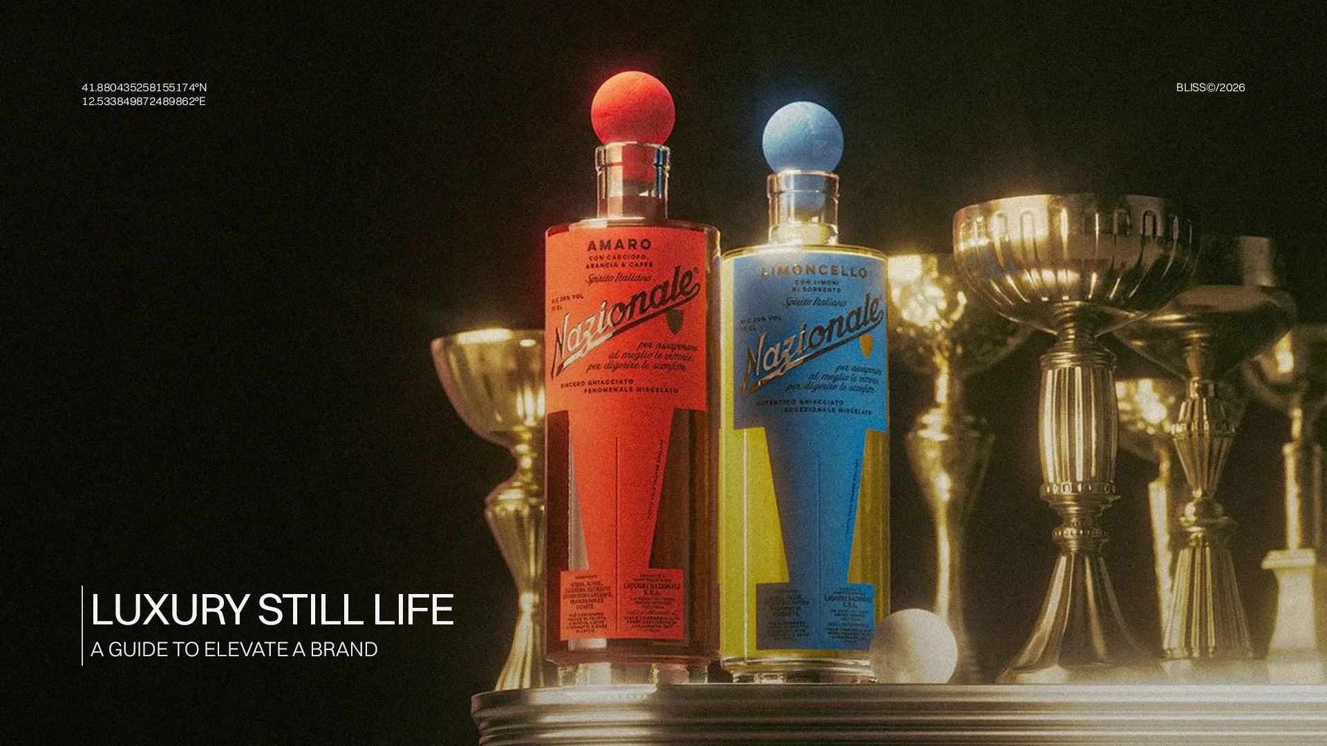
The visual identity of a luxury brand is the integrated system of visual codes, logo, typography, color palette, photographic style, patterns, and packaging, which translates the strategic positioning of a premium brand into a recognizable, consistent, and high-perceived-value aesthetic language. Unlike the mass market, in luxury, every graphic element does not merely identify the brand: it seduces it, elevates it, and defends its exclusivity across every physical and digital touchpoint.
When we enter an Hermès boutique, open a Tiffany box, or browse Brunello Cucinelli’s lookbook, we are not simply looking at products. We are crossing a visual universe built with surgical precision over decades. That consistency is not accidental, nor is it the result of purely aesthetic talent: it is the result of a structured strategic process that combines brand philosophy, competitive positioning, and visual architecture.
In this article, we will analyze, with a managerial and consulting approach, how the visual identity of a luxury brand is built: from strategic foundations to graphic assets, from real case studies to the trends redefining the sector in 2026. Whether you are an entrepreneur wanting to launch a premium brand, a marketing manager of a maison undergoing a rebranding, or a communication manager of a company intending to scale to the high-end segment, this guide is designed for you.
Bliss
Talk to a
consultant
Tell us about your project. We will find the right path together.
contact usWhat is the Visual Identity of a Luxury Brand: Definition and Perimeter
The visual identity is the coordinated set of graphic and visual elements that make a brand immediately recognizable. It includes the logo, color palette, typographic system, photographic style, iconography, decorative patterns, layout, packaging, and all the visual outputs the brand produces, from the website to the letterhead, from the physical window display to social media content.
In the luxury context, this definition is enriched with further dimensions. The visual identity does not only serve to stand out: it must signify. It must narrate excellence, history, rarefaction, and desirability. It must create what the industry calls the aura, that perception of value that cannot be explained rationally but is felt instinctively.
At an academic and managerial level, three levels of brand identity are distinguished:
| Level | Definition | Visual Component |
| Brand Identity | The set of values, mission, personality, and positioning that the brand wants to project | Strategic starting point |
| Visual Identity | The aesthetic and graphic translation of the brand identity into a coherent system of visual signs | Logo, palette, font, photographic style |
| Brand Image | The actual perception the audience has of the brand after interacting with its visual messages | Output of the visual identity |
In luxury, the distance between visual identity and brand image must be minimized. Every dissonance—an out-of-brand social image, inconsistent packaging, the wrong font on printed material—is perceived by the high-end consumer as a sign of sloppiness that erodes trust and desirability.
According to Mordor Intelligence, in 2026 the global luxury goods market reached 484 billion dollars, with a projected growth to 598 billion by 2031. In this scenario, visual differentiation has become one of the main levers of competitive advantage.
In the mass market, visual identity aims at readability and mass awareness. In luxury, the rules are partially reversed: selectivity is a value, excess visibility can damage positioning, and the visual code is designed to communicate with a restricted and highly aware audience.
Successful luxury brands share certain distinctive characteristics in building their visual identity:
| Dimension | Mass Market | Luxury Brand |
| Logo | Recognizable, accessible, frequent | Elegant, rarefied, often minimal or monogrammed |
| Palette | Vibrant, consistent with mass target | Sober or iconic (Tiffany Blue, Hermès Orange, Bottega Veneta Intrecciato) |
| Typography | Readable, universal, neutral | Exclusive serifs, custom typefaces, condensed luxury fonts |
| Photography | Bright, user-generated, inclusive | Curated, cinematic, silent, aspirational |
| Packaging | Functional, sustainable for volume | Ritual experience, premium materials, unboxing as a ceremony |
| White Space | Reduced to maximize information | Extended as a sign of rarity and control |
The 5Ws of Visual Identity in Luxury: Who, What, When, Where, Why
- Who must build a luxury visual identity? Any entrepreneur, founder, or marketing director intending to position, or reposition, a brand in the premium segment. Not just the big maisons: today, even excellent SMEs, master artisans, niche brands in food, artistic perfumery, design, and hospitality need a visual identity matching their positioning.
- What does a luxury visual identity include? An integrated system of visual assets, regulated by a brand book or brand guidelines: logo and its variants, extended color palette, primary and secondary typography, photographic style, illustrations and patterns, iconography, compositional grid, visual tone for social media and offline materials.
- When is it built or renewed? At the brand’s launch, in the event of strategic rebranding, when scaling towards a higher segment, or when a dissonance emerges between market perception and desired identity.
- Where is it applied? Across every touchpoint: e-commerce, packaging, physical boutique, advertising, editorial materials, social media, events, collaborations with influencers or cultural institutions.
- Why invest in a structured visual identity? Because in luxury, the perception of value precedes interaction with the product. A high-end consumer judges a brand in the first 50 milliseconds of visual contact, even before reading a name or description.
The Building Process: From Strategy to Aesthetics
A common mistake, even among marketing professionals, is to believe that visual identity is built starting from design. In reality, design is the last step, albeit the most visible one. The correct process follows a precise sequence:
Phase 1 – Brand Audit and Strategic Analysis
Before drawing a single stroke, it is necessary to understand the context. This means analyzing the target market, mapping visual competitors, studying the dominant aesthetic codes in the segment, and identifying the white spaces where the brand can differentiate itself. In luxury, it is essential to understand who you are visually positioning against: Chanel, Bottega Veneta, and Loro Piana occupy completely different aesthetic spaces despite sharing the same price segment.
Phase 2 – Brand Platform and Positioning
This is where strategic identity is born: mission, vision, values, brand archetype, and positioning are defined. This phase is the engine of the entire visual system. If an artistic perfumery brand positions itself as the “guardian of Italian olfaction,” every subsequent graphic choice, from the font to the photographs, must visually translate that promise. A good brand strategy workshop with key company figures is an indispensable starting point.
Phase 3 – Verbal System: Naming, Payoff, Tone of Voice
Often overlooked, this phase determines how the brand speaks, and therefore how it is perceived. In luxury, the tone of voice is an integral part of the identity: sober yet authoritative, evocative but not redundant. The naming, payoff, and communicative register must be consistent with the visual identity and not treated as separate elements.
Phase 4 – Designing the Visual System
This is where strategic identity translates into form. The main assets to design are:
| Visual Asset | Function in Luxury | Iconic Examples |
| Logo | The brand’s aesthetic signature, synthesis of its universe | LV monogram, Hermès letter H, Chanel font |
| Color Palette | Emotional and distinctive code, registrable as a trademark | Tiffany Blue, Hermès Orange, Bottega Veneta Green |
| Typography | Visual tone of the brand’s voice, signal of heritage or modernity | Didot (Vogue), Futura (Louis Vuitton campaigns), custom fonts |
| Photographic Style | Builds the aura and mood; defines light, composition, and subject | Celine (Slimane era), Bottega Veneta (radical silence) |
| Packaging | First physical touchpoint with the product; unboxing as a ritual experience | Hermès orange box, Cartier white pouch |
| Patterns and Textures | Extension of the identity on surfaces and materials | Gucci monogram, Burberry tartan, Bottega Veneta Intrecciato |
Phase 5 – Brand Book and Visual Governance
The visual system must be codified in a precise document, the brand book or brand guidelines, which regulates every use: logo proportions, minimum clear space, permitted color variations, typography per channel, photographic style in detailed briefs. In luxury, this document is not a simple technical guide: it is the Constitution of the brand’s identity, to be defended with absolute rigor on every channel and by every creative partner.
Case Study – Profumum Roma (Bliss)
Bliss’s work for Profumum Roma, an Italian artistic perfumery brand, required the design of every touchpoint, from the website to the packaging, from advertising to physical stores, to evoke a single sensory universe: elegant, mysterious, artisanal. The result is a premium brand recognizable at a glance, which doesn’t need to explain itself: the visual language speaks for itself. The case is detailed on the dedicated visual consistency page.
Bliss
Talk to a
consultant
Tell us about your project. We will find the right path together.
contact usThe Color Palette as a Strategic Asset
In luxury, color is not an aesthetic choice: it is a positioning decision. According to research by Winnipeg University, the purchasing decision is influenced between 62 and 92% by the color of products and brands. For premium brands, black, gold, and silver traditionally codify luxury and status, but the true competitive differential is achieved through a proprietary, unique, and defensible color.
Tiffany & Co. has transformed the Pantone 1837 shade into a brand asset more powerful than any advertising campaign. Robin’s-egg blue is today registered as a color trademark and alone is worth billions of dollars in brand equity. The same goes for Hermès orange, the red of Louboutin soles, and Bottega Veneta green.
Building a luxury palette requires answering three fundamental questions: what emotion do we want to evoke? With which competitors do we already share the same color code? What is the color that does not yet belong to anyone in our segment?
Typography: The Visual Tone of the Brand’s Voice
If color is the first emotion, typography is the character. In luxury, the typographic system communicates primarily through the shape of the letters, even before words. A classic serif like Garamond or Didot evokes heritage and authority. A geometric sans-serif like Futura communicates modernity and rigor. A custom typeface, developed from scratch for the brand, is the ultimate signal of exclusivity: it means the brand has invested in inventing its own visual voice.
The most solid luxury brands use exclusive or heavily customized fonts: Louis Vuitton uses a proprietary variant of Futura in its campaigns; Chanel has maintained the same combination of Couture and Bodoni for decades; Bottega Veneta adopted a spacious, almost monumental serif font in its recent redesign, reflecting its approach to “quiet luxury”.
Photography and Art Direction: Building the Aura
In luxury, having a beautiful product to photograph is not enough. You must build a visual dramaturgy. The photography of a premium brand communicates not only through the portrayed object but through light, composition, atmosphere, the relationship between full and empty spaces, and surface texture. It is a matter of artistic sensitivity supported by precise creative direction.
The emblematic case is Bottega Veneta during Daniel Lee’s creative direction (2018–2021): the brand eliminated all social media presence, resetting traditional advertising output, and entrusted every visual appearance to highly artistic editorial campaigns. The result was an extraordinary consolidation of positioning in the ultra-luxury segment, with an increase in perceived desirability that industry analysts unanimously consider one of the most effective rebrandings of the decade.
Loro Piana has built its visual identity around the principle of silence: no prominent logo, naturalistic and slow photography, materials that speak for themselves. The narrative of “quiet luxury,” where visual identity is based on the quality of the gesture rather than the strength of the symbol, has proven successful, especially in the UHNWI segment, where the absence of ostentation is itself a code of belonging.
The Role of Packaging in the Luxury Visual System
In luxury, packaging is not a container: it is the product itself, at least for the first few seconds of the experience. Unboxing is a ritual ceremony that the premium consumer anticipates and remembers, so much so that today billions of YouTube and TikTok videos document the moment of opening Hermès boxes, Dior pouches, or Cartier cases.
Excellent luxury packaging meets precise criteria: noble and sensory materials (heavy paper, fabrics, lacquers), harmonious proportions, absence of redundant elements, the scent of the cardboard, the sound of opening, durability over time. It is not a detail: according to Deloitte, brands with premium packaging record a willingness to pay 30–40% higher than competitors who neglect this dimension.
Cross-Channel Visual Consistency: The Omnichannel Challenge
One of the main risks for a luxury brand today is visual fragmentation. In an ecosystem where the brand communicates simultaneously on Instagram, TikTok, e-commerce, physical boutiques, print, events, and PR, maintaining absolute consistency is a top operational challenge.
Visual consistency is not uniformity: it means that each channel has its specific language, but all speak with the same soul. The tone of a TikTok post may be different from that of an advertising page in Vogue, but the visual code—palette, font, composition, photographic mood—must unmistakably be the same brand.
According to research by Lucidpress, brands that maintain a consistent visual identity across all channels see an average revenue increase of 23% over the medium term. In the luxury segment, where brand equity is the primary intangible asset, this consistency is worth even more.
Case Study – Risivi & Co. (Bliss)
For Risivi & Co., an Italian artisanal jewelry brand, Bliss built a minimal yet highly evocative visual system: every element, from typography to packaging, from photographic style to digital presence, was designed to convey elegance, minimalism, and artisanal authenticity. The work included the development of brand guidelines to ensure cross-channel consistency over time. Dive deeper into the process in How a brand identity is born: from strategy to visual.
International Case Studies: How Great Brands Build Visual Identity
- Hermès – Heritage as a visual system: Hermès builds every element of its visual identity around its artisanal heritage. The logo with the carriage, the unmistakable orange, the institutional typography, the “silent” photography of products on neutral backgrounds: everything communicates that Hermès is an ancient, rare brand that doesn’t need to compete. Scarcity is codified in the design.
- Bottega Veneta – “Quiet luxury” as a visual philosophy: Bottega Veneta transformed the rejection of logomania into a powerful visual code. The intrecciato, the woven leather pattern, became the brand’s invisible logo: those who know, recognize it; those who don’t know, don’t belong to the target audience. A design decision that is, first and foremost, a positioning decision.
- Chanel – Consistency as an absolute value: Chanel hasn’t changed its logo for over 100 years. The double C, the black-white-gold-beige palette, the elegant serif typography: it is a visual system built on invariance. In an industry where many brands chase trends, Chanel built its superiority precisely on the immutability of its aesthetic code.
- Gucci – Controlled reinvention: Gucci demonstrates the opposite pole: the total reinvention of a visual identity, from the conservative model of the 2000s to the maximalist eclecticism of the Alessandro Michele era (2015–2022), up to the return to a more sober elegance with Sabato De Sarno. Each phase required a coherent rewriting of the visual system—not just the logo, but the entire aesthetic code.
2026 Trends: What is Changing in Luxury Visual Identity
The luxury landscape in 2026 is traversed by several trends redefining the canons of visual identity:
- Quiet Luxury and Stealth Aesthetics: According to VML’s “Future 100: 2026” report, luxury is shifting toward an aesthetic of sophisticated understatement: fewer logos, more materials, less visual noise, more rarity. High-spending consumers, especially in the UHNWI (Ultra High Net Worth Individuals) bracket, increasingly prefer brands that are not seen but perceived.
- AI-Assisted Visual Production: Major maisons are integrating artificial intelligence into the creative process: not to replace designers, but to accelerate ideation, test aesthetic variants, and adapt the visual system to different cultural contexts. AI becomes a tool for creative exploration, maintaining human control over the final art direction.
- Sensory and Experiential Visual Identity: Luxury flagship stores are transforming into what VML calls “temples of identity”: architectural spaces that extend the visual identity into three-dimensional physical space, where architecture, lighting, materials, and even sound become part of the brand system.
- Digital-Luxury Convergence: According to Mordor Intelligence, in 2026 online channels represent 17.6% of luxury sales, with a projected CAGR of 5.05% until 2031. This requires a redefinition of visual identity for digital environments: premium UI/UX, high-quality motion design, virtual shopping experiences that replicate the boutique sensation.
- Sustainability as a Visual Code: Sustainability is no longer just a stated value: it becomes an element of the visual identity. Brands like Stella McCartney and Chopard are integrating materials, processes, and ethical values into their visual communication, making visible what was once invisible. This requires updating the visual system to include new codes signaling authenticity and responsibility.
Related Insights
- Brand Identity: a Company’s Most Important Strategic Asset: Brand identity is the foundation on which every visual system is built. Discover what it is, how it is built, and why it represents the most important investment for the long-term growth of any enterprise. → Read the full article on Brand Identity
- Rebranding: When and Why to Redo Your Brand’s Identity: Not every restyling is a strategic rebranding. Find out when it makes sense to intervene on brand identity, what signs indicate the time has come, and how to manage the transition without losing the brand equity built over time. → Explore Bliss’s approach to Rebranding
- The Importance of Visual Consistency: A brand recognizable everywhere is a brand that builds trust. Discover why cross-channel visual consistency is one of the most underrated strategic assets in modern branding, and how to implement it correctly. → Read the article on Visual Consistency
- Sound Branding: Practical Examples of How and Why it Works: Today, brand identity is not built with eyes alone. Sound branding is the acoustic dimension of visual identity: sounds, jingles, audio logos that complete the brand’s sensory system. Discover how it works and why major luxury brands are adopting it. → Discover Sound Branding on the Bliss Blog
- Branding for Luxury Companies: the Most Emblematic Success Cases: From the launch of Profumum Roma to the Risivi & Co. project, Bliss has developed visual identities for premium segment brands with measurable results: over 6.4 million views generated, 147% organic growth in direct sessions, and consolidated positioning in Italian luxury. → Read Success Cases in Luxury Branding
FAQ – Frequently Asked Questions on Luxury Brand Visual Identity
What is the difference between visual identity and brand identity?
Brand identity is the set of values, mission, personality, and strategic positioning a brand wants to express. Visual identity is the graphic and visual translation of that identity: it is what you see (logo, colors, fonts, photographs), while brand identity is what you are. In luxury, the two dimensions must be deeply aligned: every visual choice must accurately reflect the positioning strategy.
How much does it cost to build a visual identity for a luxury brand?
Costs vary significantly based on project complexity. A complete visual system for a luxury brand—including strategic research, naming, logo system, brand book, packaging, and digital guidelines—can require an investment ranging from 15,000 to 100,000 euros and beyond, depending on the project’s scope and the chosen partner’s seniority. It is an investment, not a cost: in luxury, the value of the brand equity built far exceeds the cost of the creative process.
How do you choose the color palette for a luxury brand?
A luxury brand’s palette must be simultaneously consistent with the brand’s values and differentiating from its competitors. The process starts with an analysis of the target visual market to identify already dominant colors, and develops through a creative phase seeking original and defensible shades. Black, gold, ivory, and burgundy are often overused in luxury: the greatest value is created with proprietary and recognizable colors, as Tiffany demonstrated with its blue.
What should a brand book for a luxury brand contain?
A complete brand book for the premium segment must include: brand positioning and values, logo usage (variants, proportions, clear spaces, unauthorized uses), color palette with Pantone, CMYK, RGB, and HEX codes, typographic system by channel, photographic style with mood references, packaging guidelines, instructions for social media and digital, tone of voice, and a glossary. In luxury, the brand book is longer and more detailed than in other sectors because any deviation from the system is perceived as a fracture in the brand’s aura.
Can a luxury brand have a strong presence on social media?
Yes, but with a highly curated visual strategy. Social media are not incompatible with luxury, provided every piece of content strictly adheres to the brand’s visual system and tone. According to data from the Risivi & Co. project managed by Bliss, “visual-first” social campaigns, built to seduce before selling, generated over 6.4 million total views and a 147% growth in direct sessions, proving that luxury can thrive on social media when the art direction is appropriate.
When is the right time to rebrand the visual system?
Signs indicating the need for intervention on visual identity are: dissonance between current positioning and the image perceived by the market; expansion toward a higher price segment; entering new international markets with different cultural codes; obvious aesthetic obsolescence compared to competitors; a reputation crisis requiring a communication reset. In all these cases, rebranding is not a cost: it is a strategic lever.
Is it possible to build a luxury visual identity for an Italian SME?
Absolutely yes. Luxury is not exclusive to large international maisons: there are hundreds of excellent Italian SMEs in food, design, fashion, perfumery, and jewelry operating in the premium segment without having multinational budgets. The difference between an amateur and professional visual identity does not depend on the company’s size, but on the quality of the strategic and creative process. Italy is the homeland of know-how: building a visual identity matching that excellence is a duty to the product offered to the market.
Build or Relaunch Your Luxury Brand’s Visual Identity
Bliss supports entrepreneurs, founders, and marketing directors in building premium visual identities: from positioning strategy to the complete graphic system, from the brand book to content production. With a tailored methodology, oriented toward long-term value and cross-channel consistency.