


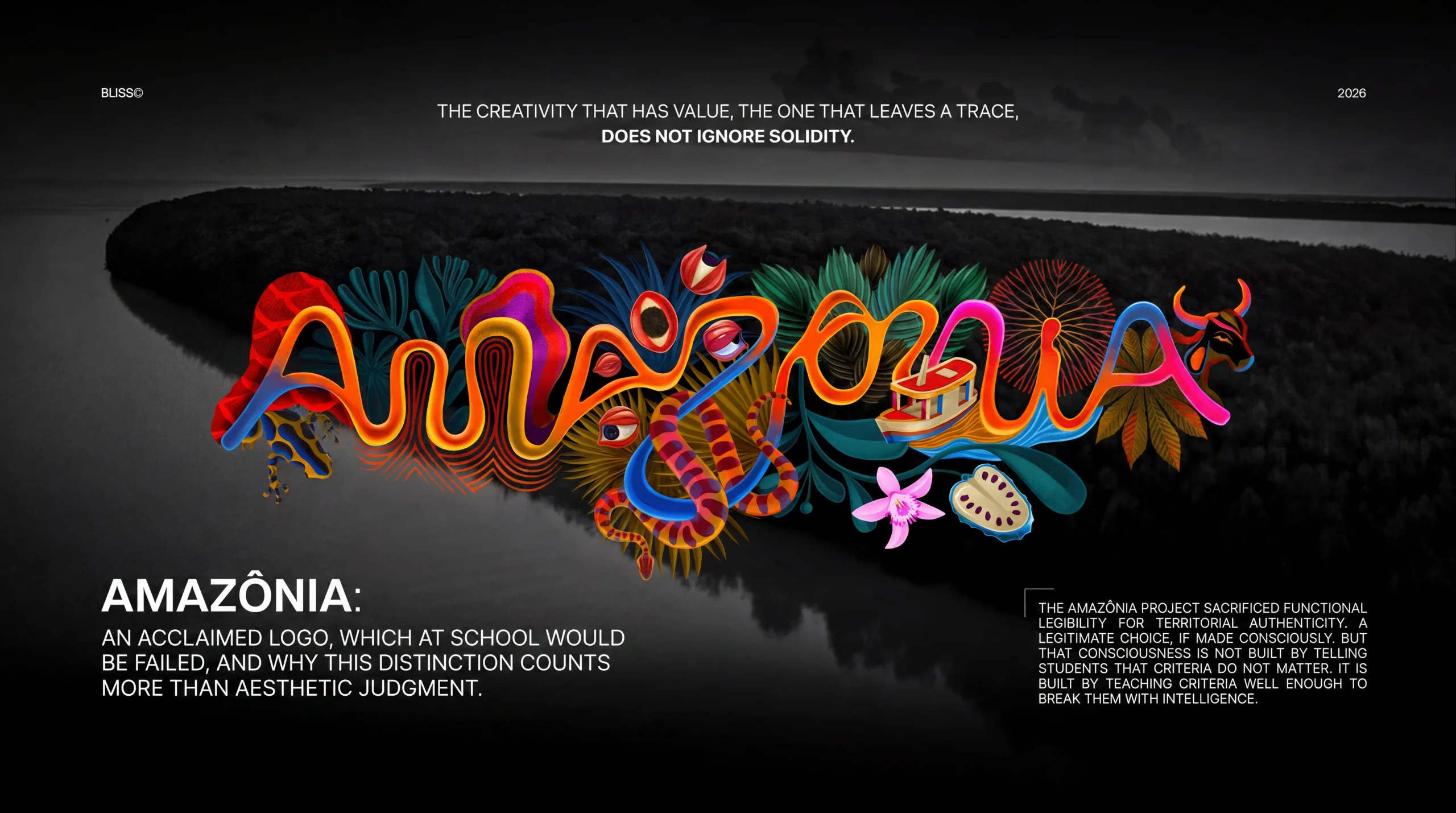
The Brazilian Legal Amazon (nine states, 60% of Brazilian territory, 28 million inhabitants, 25,000 kilometers of navigable waterways) had never had a unified brand. Each state communicated on its own, with fragmented aesthetics and positioning. It was as if the most iconic territory on the planet had never had a voice.
Now it does. Il progetto si chiama Visite Amazônia, developed by FutureBrand São Paulo in collaboration with Embratur and RAI (Integrated Amazonian Routes), with the direct participation of artists, illustrators, photographers, and professionals from the nine states. The goal is twofold: attract tourism and create an economic branding platform through the “Feito de Amazônia” (Made in Amazônia) seal for products, crafts, and experiences of the entire region.
The concept is, on paper, extraordinary. FutureBrand didn’t start from abstractions or generic symbols of the forest. It analyzed satellite images of the Amazon basin and mapped the real coordinates of the Amazon River and its tributaries, finding the shapes of an entire alphabet in the curves of the water. The brand’s typography was not designed. It was discovered. Every letter exists because that river exists. It is an identity that, in the most precise sense of the word, cannot be replicated for any other territory in the world.
Most tourist destination brands start from abstraction and arrive at a symbol. This one took the reverse path: it started from the literal territory and found the typography.
From a conceptual point of view, it is a rare piece of work. One of those cases where the creative process and meaning coincide perfectly.
So why is it causing a debate?
There is a real tension between the power of the concept and the functionality of the execution. A tension that Marketing Espresso defined as “beautiful, fast, to be consumed,” and which is legitimate as long as one moves within the attraction of novelty. But it becomes more complicated when the project is brought before an objective criterion.
The problem is legibility.
The alphabet extracted from the river has organic, variable, irregular curves by definition; and this is because rivers do not obey typographic canons. The result is a system of letters in which some shapes are difficult to distinguish, the x-height varies in an unconventional way, and the character apertures are closed in places that typographic research identifies as critical for comprehension. This is not an aesthetic judgment. It is a measurable technical fact.
The question the project poses, unintentionally, is precise and important: if a design student presented this work at a university, would it pass?
The criteria classrooms teach, and how they are challenged here
Gestalt Theory, developed by Wertheimer, Koffka, and Köhler in the 1920s and which became the foundation of every academic design course, establishes principles of visual perception that are not opinions. They are documented neurological mechanisms: how the brain groups similar elements, how it follows continuous lines, how it completes incomplete shapes, how it processes visual hierarchy.
One of the central principles is the Law of Prägnanz, the tendency of the perceptual system to prefer the simplest and most regular shape available to reduce cognitive load. A typographic identity that works against this mechanism is not entirely wrong. But it requires more effort to be processed, and this has measurable consequences on memorization and recognition.
Research on typographic legibility is equally explicit. Consistent x-height, character aperture, contrast between thick and thin strokes, spacing: these are not matters of taste. They are variables that influence the speed of letter recognition, the cognitive fatigue of reading, and the accessibility of text in different contexts.
A student presenting a custom font to an academic commission would be evaluated exactly on these parameters. And Amazônia, with its project, would fail the exam on some of these criteria.

Is the project therefore wrong?
No. And here lies the most interesting and uncomfortable answer.
The project is not wrong. It is complex. And it is complex in a way that the binary judgment of “beautiful/ugly” or “correct/incorrect” cannot contain.
The Amazônia project is structurally different from most visual identity projects. It is the identity of a territory, an institutional brand with a primarily symbolic and political function, whose primary purpose is not operational legibility but cultural recognition and differentiation on a global scale.
In this context, some rules carry a different weight. The absolute uniqueness of the system the fact that the typography exists because that river, and only that river, exists is worth more than conformity to x-height canons. The implicit message the brand sends (namely, “this identity cannot be replicated elsewhere”) is a competitive advantage that no well-constructed conventional typography could produce.
But this does not mean the criteria don’t exist. It means that the conscious choice to violate them requires an equally conscious reason. And that reason, in this case, exists.

The real problem: not the logo, but what we teach
The point that remains open, and that must be stated clearly, is not about Amazônia. It is about education.
If an industry rewards work that systematically sets aside the criteria that universities teach, and rewards it with enthusiasm without distinguishing between “conscious and motivated violation” and “ignorance of principles,” then it is sending an ambiguous signal to the generations that are learning. The risk is not producing audacious creatives. The risk is producing creatives conforming to a new convention: that of innovation for its own sake, of originality as a value independent of function.
Design criteria are not prisons. They are the shared language that allows us to understand why a choice works or doesn’t work, regardless of personal taste. Without that language, nothing can be evaluated rigorously. One can only say that something is “beautiful because it is new,” and that is not an evaluation. It is just a reaction.
The difference between a designer who deliberately violates the rules and one who doesn’t know them is not visible in the final result. It is visible in the ability to explain why they made that choice, and to understand what they sacrificed to achieve it.
The Amazônia project, with its logo, knows this. It sacrificed operational legibility for absolute territorial authenticity. It is a legitimate choice if made consciously. But that awareness is not built by telling students that the criteria don’t matter. It is built by teaching the criteria well enough to be able to break them with intelligence.

The boundary worth finding
Design has rules because it built them on decades of research into how human beings perceive, process, and remember visual information. That research is not rhetoric. It is the neuroscience of perception, cognitive psychology, and studies on attention and memory. It is solid.
The creativity that matters, the kind that leaves a mark, does not ignore that solidity. It knows it well enough to know exactly where to push to produce something unforgettable.
Amazônia has produced something unforgettable, but it has also produced a typographic system that, in many real-world use contexts, will be difficult to read. Both things are true. Holding them together, without choosing a single narrative, is the hardest work.